BrushLens by Soren Ulsig · for oil painters

Know exactly what to mix - before you touch the canvas

Tap any spot in your reference and get the recipe from the tubes you own, like 40% Yellow Ochre + 40% Titanium White + 20% Alizarin Crimson. Then read the values, the temperature and your drawing the same way.

Try free for 7 days

Then $7/month. Cancel yourself from Manage Account, anytime.

Or $59/year · or $199 lifetime

Your photos never leave your device

Try it: tap the painting
Mixing recipe
from Soren's palette, 15 tubes
--%MATCH
Value -/10Temp -
Runs in your browser. Nothing to download, on the phone, tablet or computer you already have.  ·  Built by a painter, used at the easel.

Why paintings go wrong before the first stroke

Your eye reads the photo. Your painting needs the truth.

A camera flattens values, shifts temperature and hands you a color you still have to mix. Most of the scraping off happens because of what the reference never told you.

Here's why your portraits look flat

The camera squeezed the values, and you believed it

Squinting only gets you so far. Values groups the reference into 2 to 10 real steps, so the big light and dark shapes are settled before color gets a vote.

You start with a value plan, not a guess.

The number 1 mistake painters make

Mixing every color from scratch

Fifteen separate mixes across one cheek never hang together, because none of them came from the same place. A base mix does what you do at the palette: one pile, pushed.

Skin reads as skin, not as a patchwork.

What actually makes it feel real?

Knowing what is warm, what is cool, and where the chroma lives

Shadows are usually cooler than you expect, and the strongest color often sits in the halftone, not the light. BrushLens shows you both before you commit paint to them.

You spend your strongest color where it counts.

From scraping off failed passages to starting every painting with a plan.

Eight tools, in the order you paint

Read your reference. Then check your painting.

PlanSettle the big decisions before color gets a vote.

01

Notan

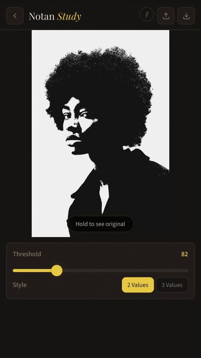
Reduce everything to a 2- or 3-value pattern with live ratio readouts. If your notan doesn't read, your painting won't either. Check it here before committing hours on canvas.

BrushLens Notan Study showing a 2-value black and white pattern

02

Values

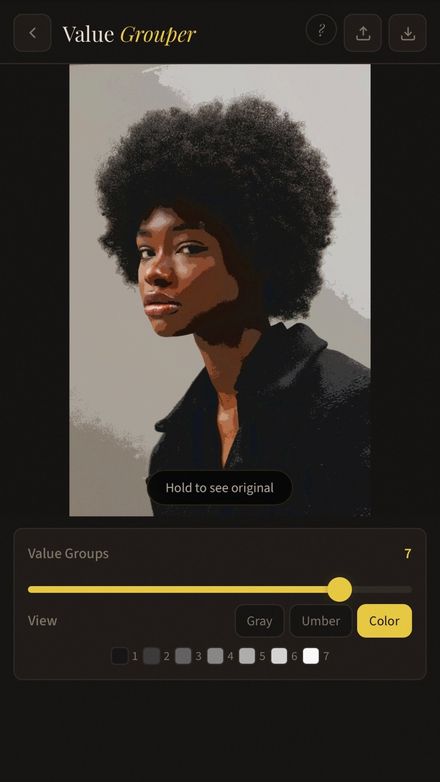
Group your reference into 2 to 10 value steps. See the big shapes immediately, in grayscale, umber, or full color. This is what most painters skip and then struggle with.

BrushLens Value Grouper showing a portrait grouped into 7 color values

03

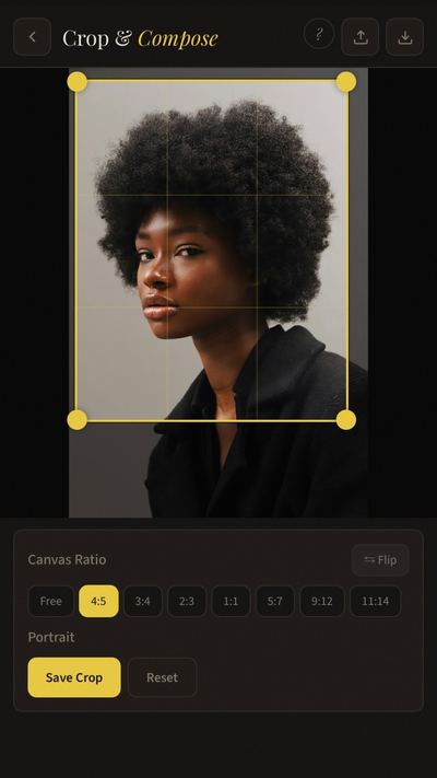
Crop

Plan your composition with common canvas ratios and composition guides (Rule of Thirds, Golden Ratio, Diagonals). Find the strongest crop before you start drawing.

BrushLens Crop and Compose tool with canvas ratio options and rule of thirds overlay

MixGet the color, from the tubes you actually own.

04

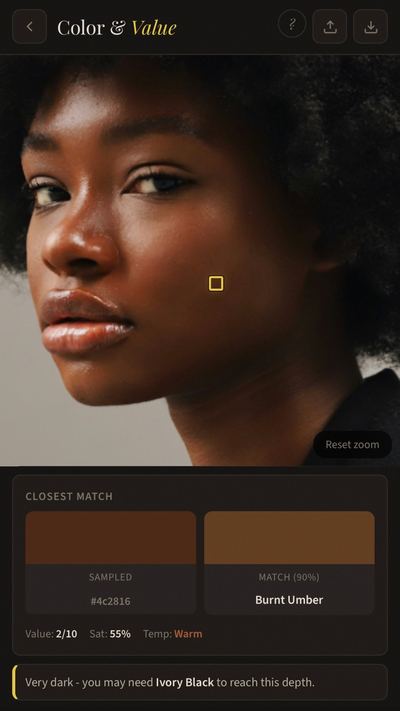
Color & Value

Tap any spot and get an actual mixing recipe from your palette - like "40% Yellow Ochre + 40% Titanium White + 20% Alizarin Crimson" with a match score. Lock a base mix and every reading after it comes back as your base plus what you add, the way you really work from one pile of paint. Hold for a precision loupe, or switch to Value Map mode and plot up to 10 points on a value scale.

BrushLens Color and Value tool showing sampled color matched to Burnt Umber from palette

05

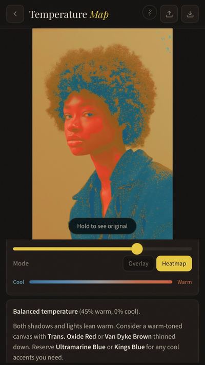
Temperature

See the warm and cool zones mapped across your reference, with breakdowns showing the temperature balance in your lights, mids, and shadows. Get concrete advice on canvas toning and color strategy.

BrushLens Temperature Map showing warm and cool zones across a portrait

06

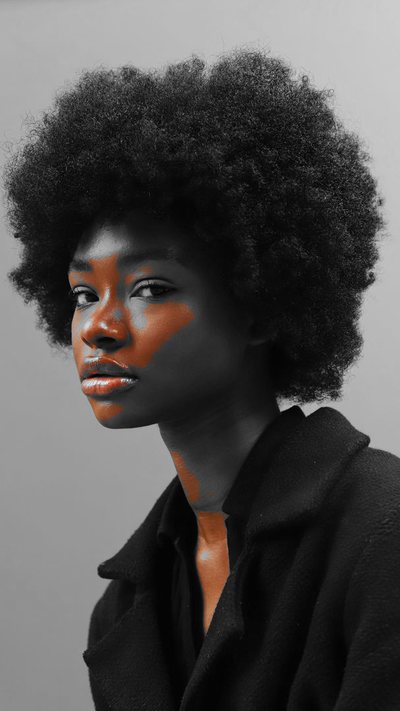
Chroma

See exactly where your reference is most and least saturated. Isolate mode keeps only the high-chroma areas in color - so you stop over-saturating shadows and know where to spend your strongest color notes.

BrushLens Chroma Map isolating the most saturated areas of a reference in color while the rest is grayscale

07 New

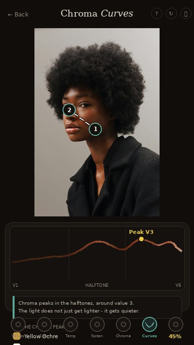
Chroma Curves

Tap the darkest point of a form, tap the lightest - and see exactly how chroma travels through the passage, with a gold marker at the peak and a mixing recipe for it. The light doesn't just get lighter. It gets quieter.

BrushLens Chroma Curves showing how chroma travels from shadow to light across a form

CheckHold your painting up against the truth.

08 New

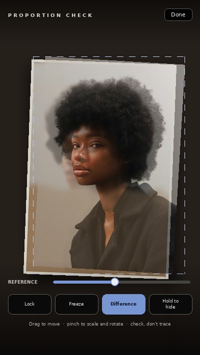
Proportion Check

Point your camera at your painting and your reference ghosts over it, live. Flip on Difference mode and your mistakes literally light up while everything correct goes dark. It's your teacher's feedback loop - without the teacher. Check, don't trace.

BrushLens Proportion Check ghosting a reference photo over a live camera view of a painting in progress

Base mixes

Here's why a face made of separate mixes never hangs together

You mix a skin tone that finally works. Then you move two inches across the cheek, mix the next one from scratch, and it doesn't belong to the first. Do that fifteen times and the face falls apart - not because any single color is wrong, but because none of them came from the same place.

That isn't how you mix at the palette. You mix one mother color for the midtone, divide it into piles, and push each pile: a little white into the light, a little blue into the shadow, a touch of rose where the ear turns warm. One mix carries the whole passage, and that shared parent is what makes skin read as skin instead of as a patchwork.

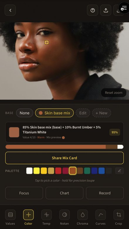
So BrushLens works the same way. Pick the tubes your base is built from, sample your midtone, and lock it. Every reading after that comes back as your base plus what you add - 85% Skin base mix + 10% Burnt Umber + 5% Titanium White - instead of a new recipe every time. One pile, pushed.

Set up as many bases as the painting needs. Skin for the head, another for a background you'd never mix from skin tone, a third for the fabric. Switch between them as you move around the canvas.
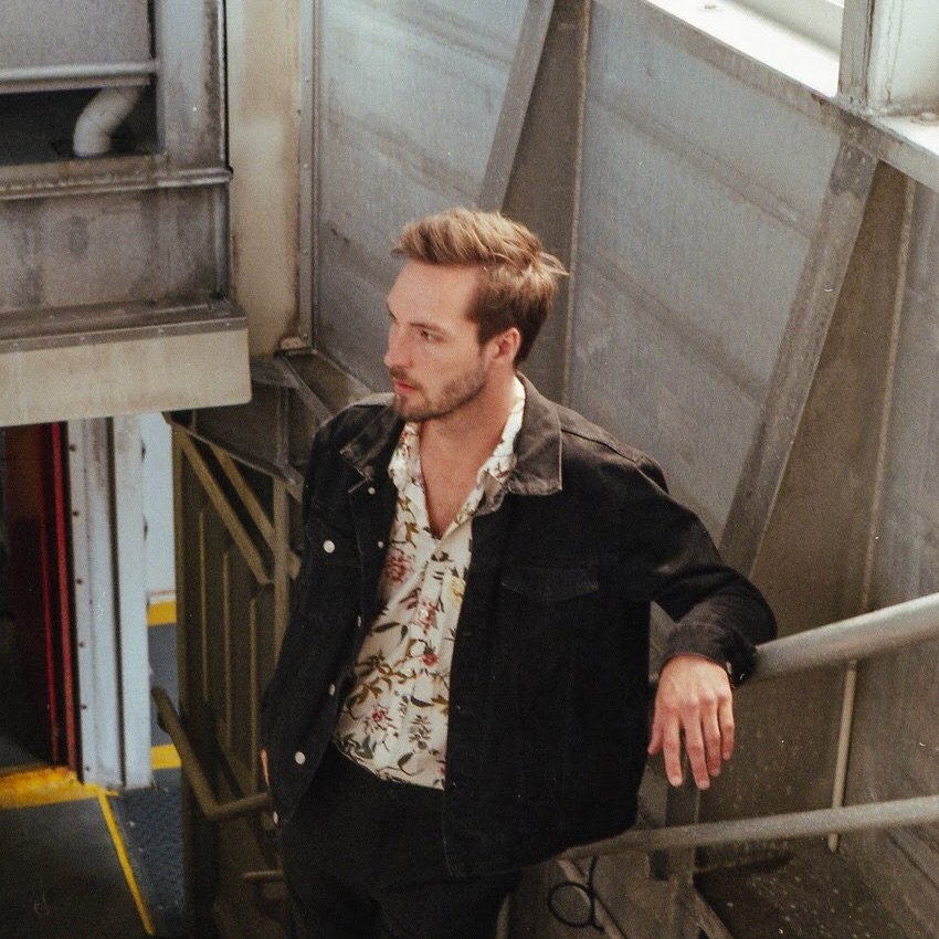
Try it on your own reference
BrushLens with a locked skin base mix, reading 85% Skin base mix plus 10% Burnt Umber plus 5% Titanium White at 95% match
The light
The midtone
The shadow

One pile for the whole passage. Each reading is your base plus what you add.

Away from the screen

For the ones who paint from paper

Plenty of painters print the reference and clip it beside the canvas rather than squinting at a phone with wet hands. Two things in BrushLens are made for exactly that, and both come out as a file you can print.

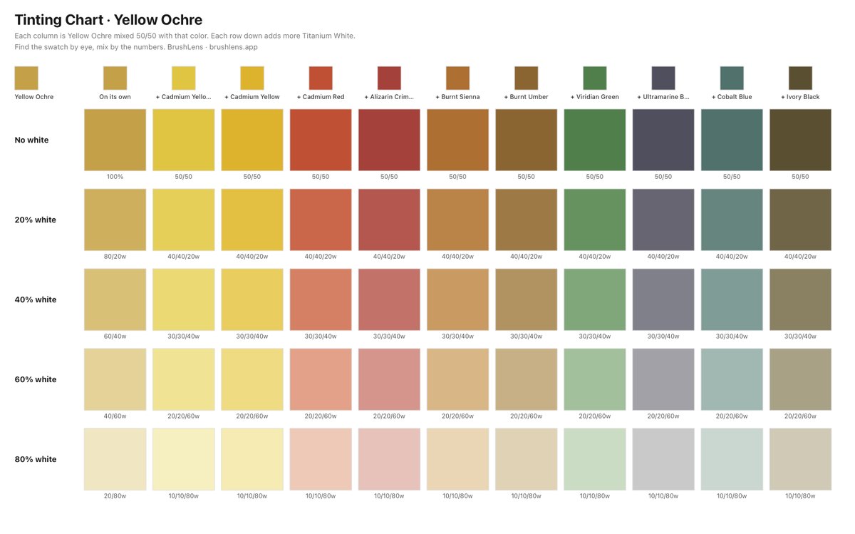
Printable BrushLens tinting chart: Yellow Ochre crossed with every other color in the palette, each column stepped down in white

The mixing chart. Hold one pigment constant and BrushLens crosses it with everything else you own, then walks each column down in steps of white. Reading a column top to bottom shows how far that pigment carries before white swallows it - that is tinting strength, the difference between a tube you add by the knifeful and one where a speck takes over. Every square has its mix printed underneath, so you find it by eye and mix by the numbers.

An honest note: the printed chart is for finding the swatch, then mixing by the numbers under it. Do not match wet paint against the print, or your printer's color cast ends up in the painting.

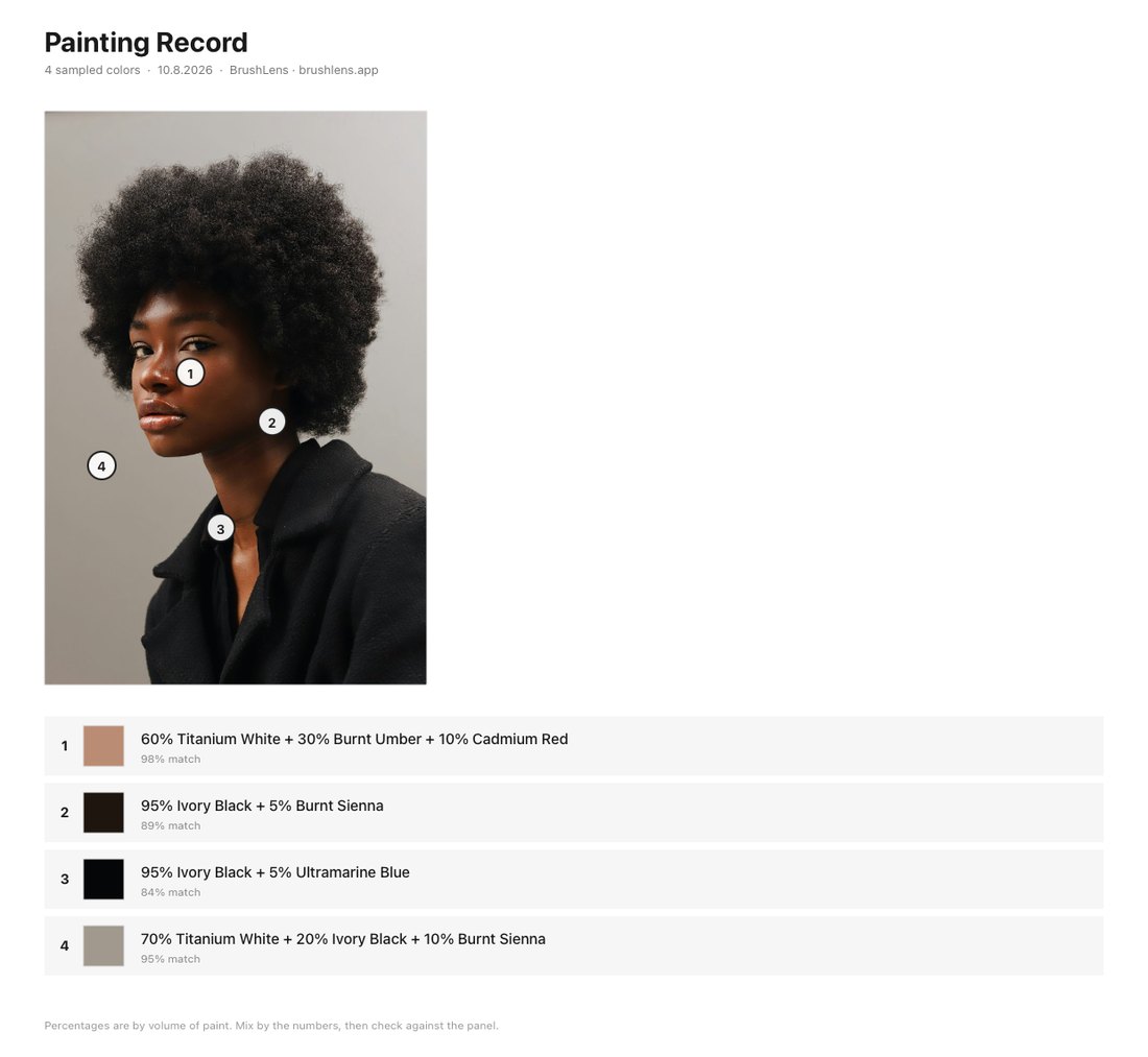
Printable BrushLens painting record: reference photo with numbered sample points and the mixing recipe for each one listed below

The painting record. Every color you sampled, numbered on the reference and listed underneath with its recipe. Print it, tape it to the back of the panel, and when you come back three weeks later you pick up the same mixes instead of guessing at what you did.

From painters using it

“I'm finally understanding color and value”

“Your app is amazing! I’m finally understanding color and value!”
Kim · BrushLens user
“Portraits can be so challenging so I find this tool so helpful. This is such an efficient and valuable tool to help the learning process!”
Lauri · BrushLens user
“As a beginner I enjoy your method of doing the values first.”
Ciara · student of Soren's
“I’ve been using BrushLens for a few months now and it has helped me so much. This is the best app I’ve ever come across - can’t thank you enough.”
Nicole · BrushLens member since January
Soren, oil painter and educator

Built by a painter, not a software company

I'm Soren - an oil painter and educator. I built BrushLens because I kept doing the same analysis by hand before every painting: squinting for values, checking temperature, testing crops. Every tool in here is something I actually use at the easel, built around one principle: value first, then temperature, then color.

- Soren, oil painter & educator

Pricing

Everything, for less than one tube of paint

Seven days free on the subscriptions. Your card is entered now and not charged during the trial, and we email you three days before it ends.

  • All eight tools, unlimited use - analysis before you paint, feedback while you paint
  • Mixing recipes from your palette - 100+ pigments, custom colors
  • Lockable base mixes, so a whole passage comes out of one pile of paint
  • Printable mixing charts and painting records for working away from the screen
  • Every new tool and update, included as it ships
  • Works on phone, tablet and desktop - nothing to install
  • Your photos never leave your device

If it doesn't change how you start your next painting, cancel from Manage Account before the trial ends and pay nothing.

Before you ask

Do I need to install anything?

No. BrushLens runs in your browser - phone, tablet, or desktop. If you want it on your home screen like an app, you can add it in two taps, but it's optional.

Does it work on iPhone and iPad?

Yes. BrushLens is built mobile-first and works on iPhone, iPad, Android, and any desktop browser. Saved studies stay on your device.

Does it work with my paint palette?

Yes. Pick from presets like the Essential 12 or Zorn, or build your own from a library of 100+ pigments - you can even add custom colors. Mixing recipes are calculated from the exact colors you own.

I use different palettes for different work. Can I save more than one?

Yes. Save as many palettes as you like and name them however you think - by instructor, by genre, by the box you take outside. Switch between them in a tap, and they follow your account to your phone, tablet and desktop.

I paint from a printed reference, not a screen. Is this any use?

That's what the printable mixing chart and painting record are for. Print the chart on the same printer as your reference and the color shift lands on both, so the square you match by eye still points at the right mix - and the recipe is printed beside it, which is what you actually mix from.

What if it's not for me?

Then it costs you nothing. Try every tool free for 7 days on your own reference photos. If it doesn't change how you start your next painting, cancel from Manage Account before the trial ends and you won't be charged.

How do I cancel?

Sign in, open Manage Account at the top of the app, and cancel there yourself. No email, no waiting for a reply. Cancel during the 7-day trial and you pay nothing at all.

Your next painting starts with a plan

Bring one reference you are about to paint. Give it seven days. If it does not change how you start, cancel from Manage Account and pay nothing.

Try free for 7 days

Your photos never leave your device · Runs in your browser, nothing to install